
Designing Help in Digital Products
When users start using your digital products, they’re going to need a little help from time to time. The good news is that there are standard design patterns that can be used to reduce the time spent on designing and provide a good user experience.

In an ideal world, our digital products should be so simple and easy to understand that the users would never have to contact customer service.
The goal of any software product is to make it as intuitive and easy-to-use as possible. The more time you spend learning a new program, the less time you have to use it. That’s why we need to make sure that our product is intuitive enough for the user to not need any help from customer service.
But we all know the reality.
Users occasionally want assistance. Because digital products are still relatively new, not every user is familiar with traditional usage patterns, and most digital products are likely to present new concepts or ideas to the user at some point throughout their engagement.
The good news is that common design patterns may be used to minimize design time for assistance in user experiences. There are also some valuable guidelines that may be used to improve the overall UX of support. Familiarizing yourself with these can increase the value of your support capabilities to your consumers.
Now that we know how help can be useful in improving the user experience, let’s dive into some common design patterns that can make this task more manageable.
Design Patterns For Effective User Assistance
When it comes to offering assistance in digital products, several design patterns have proven to be extremely useful. Let’s explore a few of these patterns, each tailored to address specific user needs.
Demonstrations
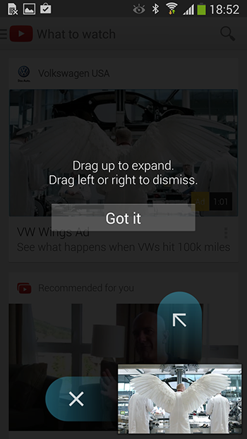
A demo is mostly a video or animated walkthrough of key functionality. They are best when they're short and relate to a specific area of functionality. Demos show the user the app without having to go through a lot of screens. However, it’s worth noting that the demo videos consist of playback controls like play, pause, skip forwards, etc, only be used when the app is first launched with valuable notes to allow the user to recognize their value.
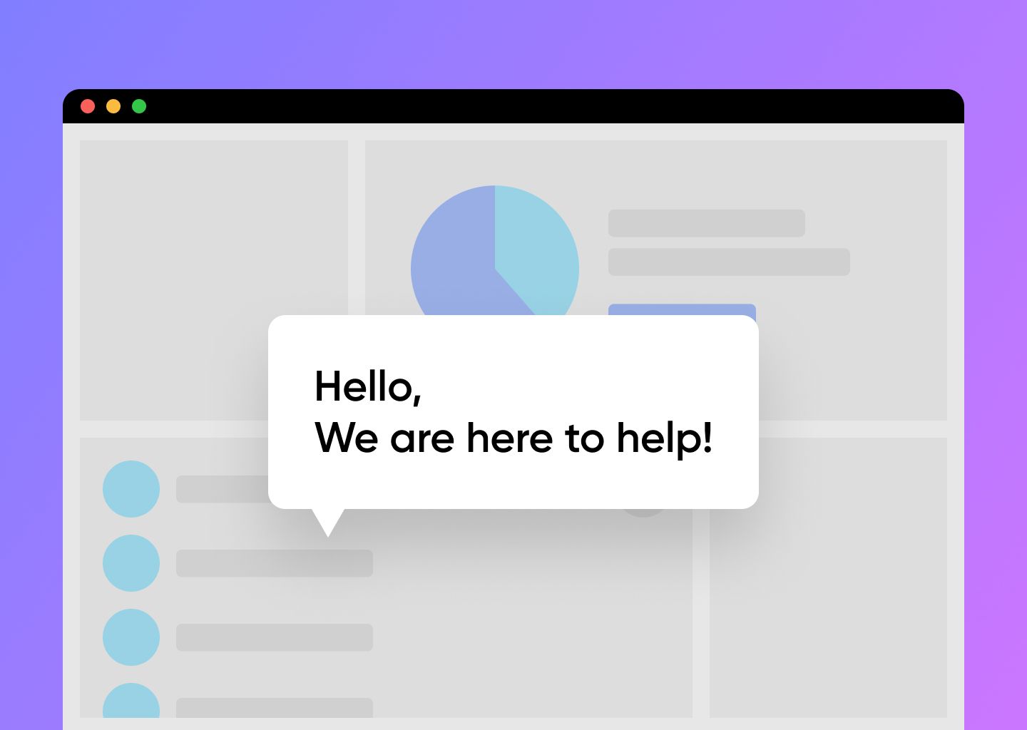
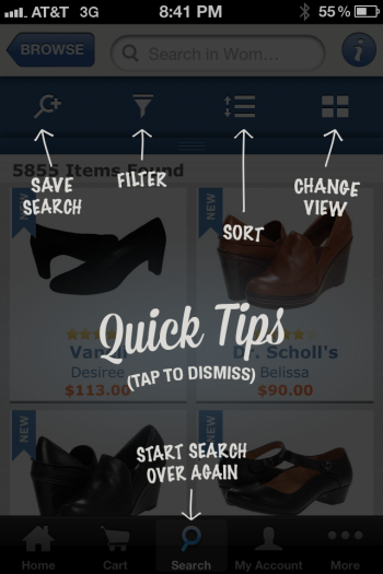
Single-Screen Overlay
An overlay is placed over the screen, explaining up to 5 areas of interest. When the user is finished with it, the overlay should be simple to dismiss. Overlays can be utilized as needed throughout the application. To enhance readability, keep explanations simple. Overlays help present concepts within the context of a screen and may be quite beneficial for describing individual feature functionality. Please keep in mind that they are less effective when discussing very complicated features or processes that move from screen to screen.
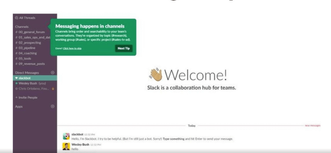
Walkthrough
A walkthrough takes a user through a process from start to finish. This can be very useful to encourage additional use of the application or to encourage a user to try out different features within an app if we cover that feature in the walkthrough. The best walkthroughs are limited to a couple of key features within the app.
Walkthrough design by Grzegorz Oksiuta
Tips
Tips are intended to offer a single piece of information at the precise moment the user requires it. They can be used when an app initially starts up, when a user visits a screen, or when a user completes a step in the process. They are excellent for introducing new features. There should always be an option to disable tips. They are best used to explain simple ideas and should not be used in place of tutorials, walkthroughs, etc.
Single-Screen Summaries
This is a basic overlay providing a brief description of the screen about to be used. It can be closed by the user or just disappear after a few seconds (around 5 seconds). It should only be used the first time a screen is accessed and should not be used again.
After exploring the practical application of these design patterns, let’s shift our focus to the foundational principles and best practices for their successful implementation.
Best Practices for Providing Assistance in Digital Products
While the design patterns offer great potential, it is crucial to pair them with best practices to ensure they serve their purpose effectively. Let’s discuss some of these practices to maximize their impact.
- The help is the most important part of your product because it's where people go when they need assistance with using it. Help should be designed in a way that is easily accessible, well-designed, and up-to-date with information on how to use the product.
- Users should have access to a range of different types of help and support for their digital products. This can include tutorials, self-service FAQs, click-to-call to chat with an agent, alerts, and so on, and it's important to be able to switch between them at any time.
- Tutorials or introductions should be the first thing a user sees when interacting with an app or website for the first time. There should always be an option to skip it and come back to it later.
- Help content should be made available when functionality is added or changed and when rarely-used functionality is accessed.
- Help videos can be beneficial, but only if the user has complete control over playback. This includes the facility to start, stop, or pause, move to the section they want to view, and the volume of the playback.
Conclusion
When designing these help, tips, and other types of hints to make the user's experience easier and smoother, take into consideration that they should be simple and quick to read, as well as easy to close. The primary tasks should be prioritized, and the assistance should always be different from the main user interface so that it is easy to identify.
Also, designing assistance for your users should always include user research and queries such as "Why do they need help?", “What do users wish to accomplish?”, “At what point will they require assistance?”, “What can't users accomplish without help?” and so forth. Once we, as UX designers, understand these challenges, basic design patterns and guidelines for designing valuable help will come in handy.
To Summarize
- Understand why users need help and design help using common design patterns.
- Provide a range of different types of assistance to help your users navigate through your product.
- Help should be made available when a new functionality is added or when users interact with a functionality for the first time.
and lastly…
- Design your product to be as intuitive and easy to use as possible so that users don’t need help.
Want more insights and expert tips? Don't just read about Design! Work with the design team at Codemonk and experience it's effective use case firsthand!